.png)

This project was a collaboration between Ipsos and Experience Studios at Purdue University.

Collaborative research and user-centered design to enhance Ipsos iSay's survey & rewards dashboard.
As a Graduate student, I directed a team of 8 UX students in research and design efforts to enhance the digital survey experience, while liasing with industry professionals to align design goals with business objectives.
3 Months - January, 2024.

This project was a collaboration between Ipsos and Experience Studios at Purdue University.
Ipsos is a Global Market Research firm based out of Paris, France. The company has various wings ranging from Strategy3 to UX.
Ipsos iSay is a survey-for-rewards platform where users can sign up to answer various studies and earn points redeemable for gift cards.
The project resulted in the design recommendations for the Survey and Rewards Dashboard for the iSay website.
See in detail

A team of 8 UX students, from Freshman to Senior year and Graduate level, we accomplished this project through scaffold learning and collaborating with the project sponsors and mentors.

Associate Professor, Purdue University.

Teaching Assistant, Purdue University.

Global CTO, Ipsos.

EVP of UX & Human Factors,
Ipsos.

Head of Access, Ipsos.
Met with sponsors to understand their needs from the project.
Scoped out the student team's bandwidth considering the limited time to execute this project.
Proposed an estimated project plan and deliverables considering bandwidth.
The sponsors needed an evaluation of their platform, originally with recommendations to implement AI agents within the web platform as well as decrease the drop off rate of survey takers.
A high level methodological approach towards identifying the problem and addressing it with appropriate solutions.

The initial task for this project was to understand the survey-for-rewards space to create a comprehensive competitor report.
A range of online survey-for-rewards platforms identified in collaboration with the sponsors.


By creating a standardized evaluation metric and using it to evaluate the web platforms of all competitors.
Elements promoting sign-up and any other unique features.
Ease of Signing-up or Logging-in and points of friction in the sign-up flow.
Elements making the survey experience enjoyable or unpleasant. Also assess the ease of redeeming rewards.
Also listed below are a few insights synthesized from the bank of data collected through assessing 12 competitor platforms.
Communicating the urgency of signing up and the value of 'survey-for-rewards' platforms to users.
Using a simple design language to enable the user to focus on earning rewards.
Enhances the perception of 'control' the user feels while using these platforms.
Employing ADA compliant interfaces and accessibility tools to enhance usability for a wider audience.
Almost all the platforms followed a general user flow from the point a user lands on the website to the point they start giving a survey to earn rewards.
We hence designed an initial user flow using all the information collected through the competitor analysis.

The evaluation of the Ipsos iSay platform shown here was conducted in February 2024. The subsequent evaluation hence shows the version of the website active in February 2024. The website has since been updated to a newer version.
Evaluating Ipsos iSay using Heuristic Evaluation and User Interviews to identify gaps in its experience.
A structured evaluation approach conducted for 2 major sections of the Ipsos iSay platform - Landing Page & Survey Dashboard.
Structured & unstructured User interviews over 2 rounds to understand a potential user's motives & thoughts while answering an online survey.
Comparing and synthesizing insights from all the methods used to evaluate the platform to create design recommendations.
A brief summary of insights synthesized from the detailed heuristic analysis for the Landing Page & Survey Dashboard.

The user interviews primarily helped the team identify gaps and issues in the survey answering flow.
This was one of the most difficult questions to answer during the project given that survey platforms would be used by a range of individuals. However, by identifying the most accessible demographic and confirming the business relevance with the project sponsors, we concluded on one demographic.

Answering a survey for the user followed the below structure but lacked a significant amount of user notification which led to severe confusion among users.

Insights were grounded in relevant literature to provide a deeper understanding of the issues and guide us toward potential solutions.
By following design sprints increasing in fidelity, we arrived to designing a survey dashboard which satisfied the design & business requirments.
Collaborating with the sponsors to define the direction of design through the research insights identified.
We finalized focusing on the Survey Dashboard for the final design & requirements based on the business requirements and limited timeline.
The proposed design was geared towards simplifying the survey dashboard, along with a few supporting recommendations regarding a more informed survey for a user.
A cleaner dashboard, designed with intent towards focusing the user towards taking more surveys.

By dividing the dashboard into focused sections, we enable the user to quickly transition earned rewards to redemption - of course with appropriate user notification to tackle user confusion.
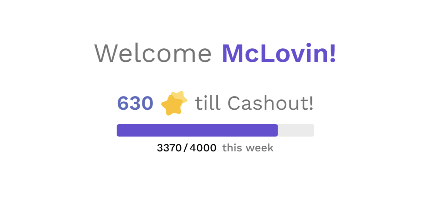
Incentivizes users to return to the platform to redeem points in the form of real money instead of gift-cards.
To get the user to begin a survey as soon as possible, the dashboard shows a limited amount of surveys available to not let the user fall into a loop of choice and reduce the cognitive load caused by decision making.

A range of information is provided on the study card to give further context to the user as well as support business needs.

Although we concluded the project, there were still aspects which needed to be tended to. This section covers all the business impacts of our design decision.
It is also about support, collaborative learning and a little bit of fun!